There are various ways to display data, but there are a few things to consider before creating a graph to convey to that data to someone else.
Whether it is numerical or categorical, a means to convey the composition of your data is a common necessity.
An initial basic composition assessment is a good place to start with any dataset. Identify the target variable. Composition implies that the samples are from a set or group, with characteristics that differentiate each individual from the larger group, or divide them into subsets through the attribute(target variable) in question.
For instance, say I am assessing the sentiment of a set of tweets. All of the samples are in the larger group, tweets, however, there are negative and positive sentiments associated with each sample, to be used for a classification task. One way to visualize the data is a pie chart, which is effective in this case due to the large difference between the count of negative versus positive sentiment. This shows that the dataset is severely unbalanced, which will require consideration when creating a classification model for this dataset. Pie charts should always add up to one hundred percent.

Side note: When presenting information, always add a title to your graph, even if no one else will see it except for you, even if it’s a super basic title describing the contents of the visualization.
Another way to visualize the composition of data is a stacked column chart. In this chart, you can visualize subsets within subsets, as the y-axis is used to separate the group into 4 individuals. Each individual has read books, nonfiction and fiction, which are shown as percentages on the x-axis. This graph can get confusing for the viewer, due to the orientation of the numeric data axis. For instance, Amilie, roughly 25% of the books she read are nonfiction. The viewer must then subtract that to get the fiction data. It is, however, an impactful visualization for simple comparison purposes.

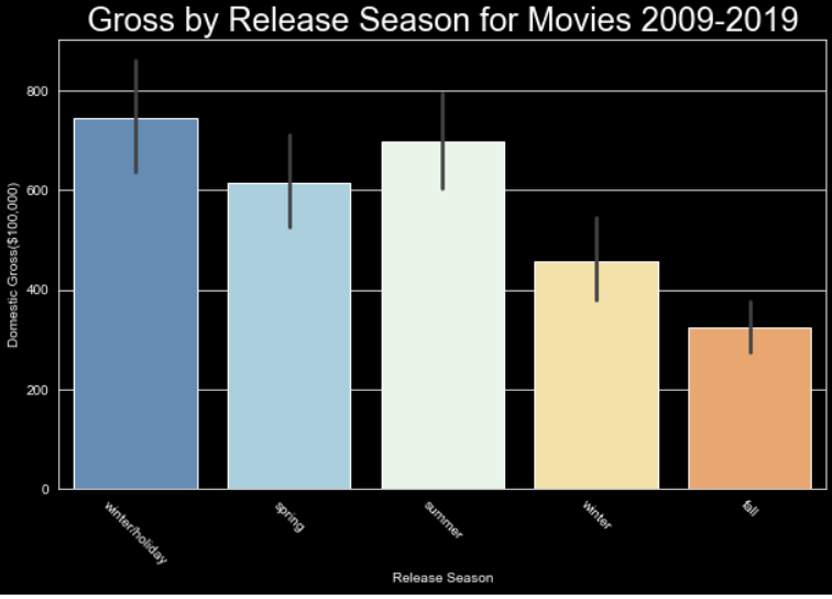
A bar chart can be used to visualize values for categorical variables. The outliers and different quartile ranges can be added as visual options using Seaborn or Plotly, providing an extra layer of information.
Say we want to see the way data changes over time, or to compare two variables within the dataset, one being a continuous variable, we can use a line graph. Line graphs can be used to show change over time, visualize outliers, and compare relationships. Here is an example of relaying information with a line graph. The x-axis shows the age of homes, this is the continuous aspect of the data. The dark blue line is the mean price in the tens of thousands of dollars for homes of the age indicated on the x-axis. The light blue shows the variance within the homes of the age indicated. Line graphs are great for visualizing trends and chart continuous data over time.

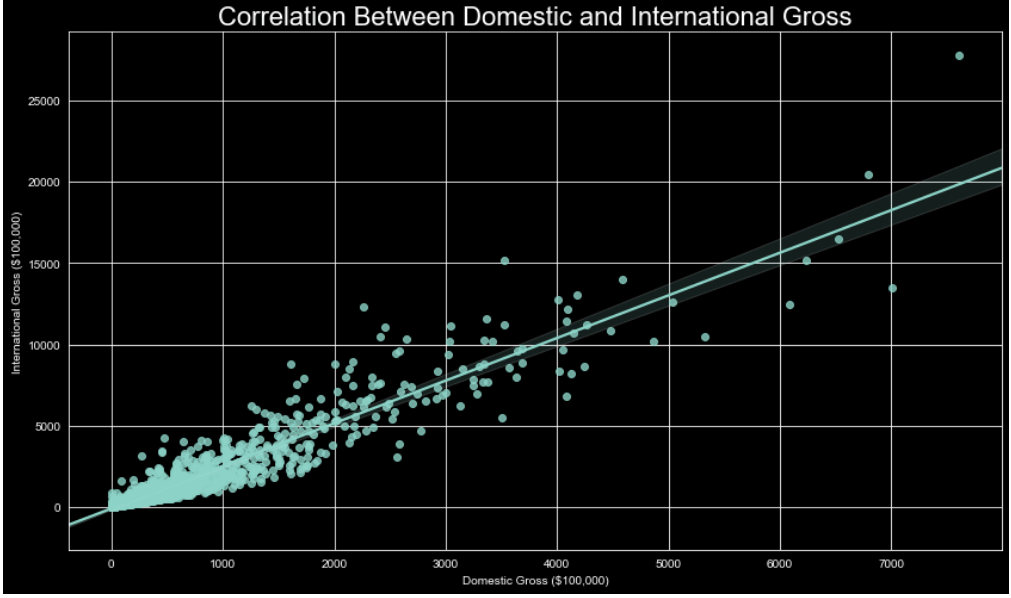
A scatter plot is used to visualize trends as well. Rather than a single line, representing the mean, each data point is placed representing the values of the two variables on the x and y axis for said data point. This is a helpful way to visualize outliers and compare feature correlation.
These are just a few of the most commonly used methods to visualize data using graphs. There are 3 dimensional axis options, flow charts, boxplots, waterfalls, and more, but to truly understand the relationships between variables, these graphs are sufficient for the task, and more robust options are available within these as well.
