The violin plot is, in my opinion, very underrated. Everyone knows the box plot ( or the box and whisker plot), but the violin plot can do everything a box plot can do, with more style. It’s a great way to visualize density representation, the wider parts of the violin body show a higher density. The outliers are visible from the elongated portions from the top to bottom(depending on the plot, sometimes it’s side to side, see, versatile!). You can even represent your data with a boxplot within your violin plot.

Using the ‘point’ or ‘stick’ parameter, view individual data points. Saturate the color to give a color representation of the density. There isn’t much this plotting system can’t convey. It makes sense at first glance too, so it’s hard to refute the clarity with with the violin plot is capable of conveying information.

Using the ‘hue’ parameter, visualize two variable’s density side by side. Add the quartiles and convey more information in less space.

Orientation is not an issue for, it provides more creative license in conveying information. The heavier distributions are seen as the tall violins, and the wide spread distribution with its outliers, evident as it spreads across the graph’s X axis. The violin plot provides the creator the versatility to condense a variety of information in an artistic way that even the most dense of us can understand.
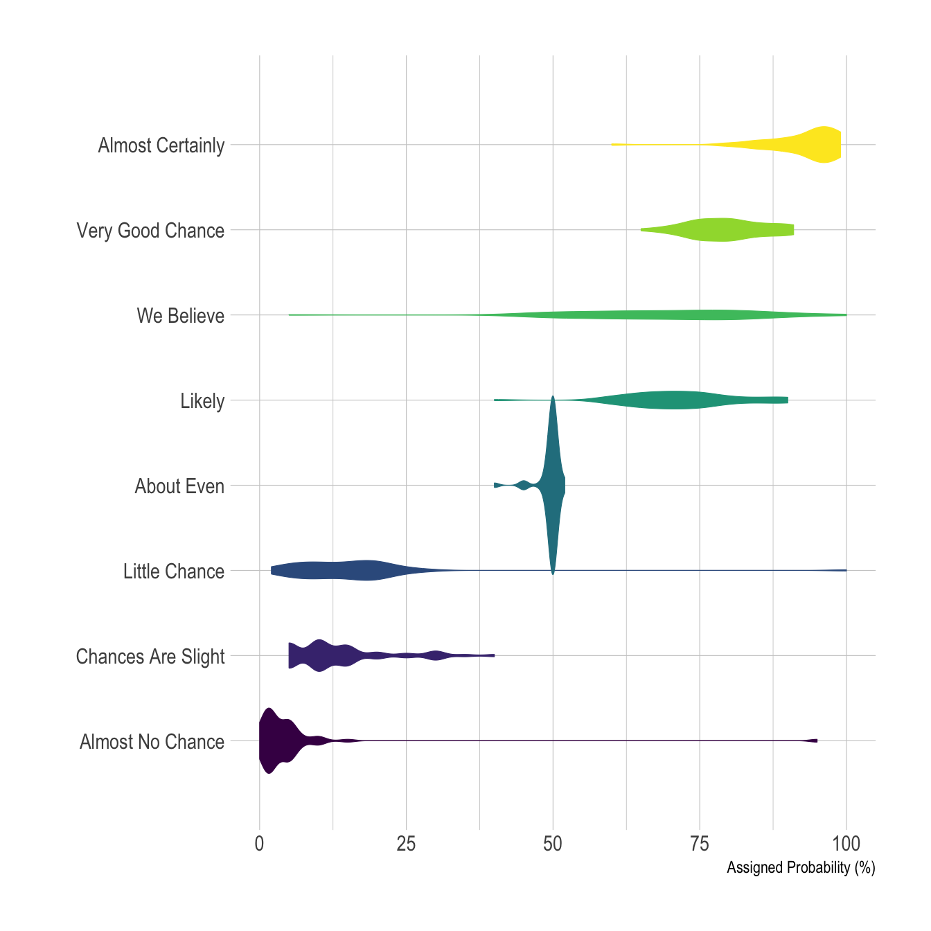
So, next time you’re creating a presentation, or just trying to visualize data for yourself, don’t lose hope. The violin plot can show you the way.